Last update December 26, 2019 by Javier Argudo
It is clear that everyone likes. In many cases sports brands are right and perform really beautiful designs , sin embargo otras veces han cometido ‘crímenes’ visuales que han generado gran polémica y rechazo por parte de los hinchas de determinados equipos . We review some of the ugliest shirts and controversial history although I must say that the list could be much longer.
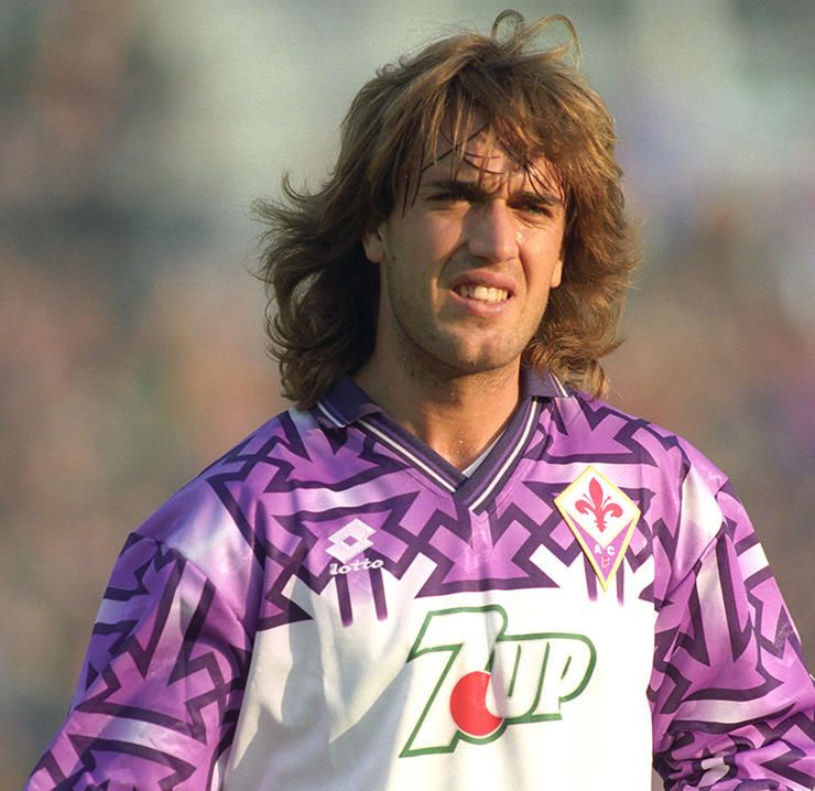
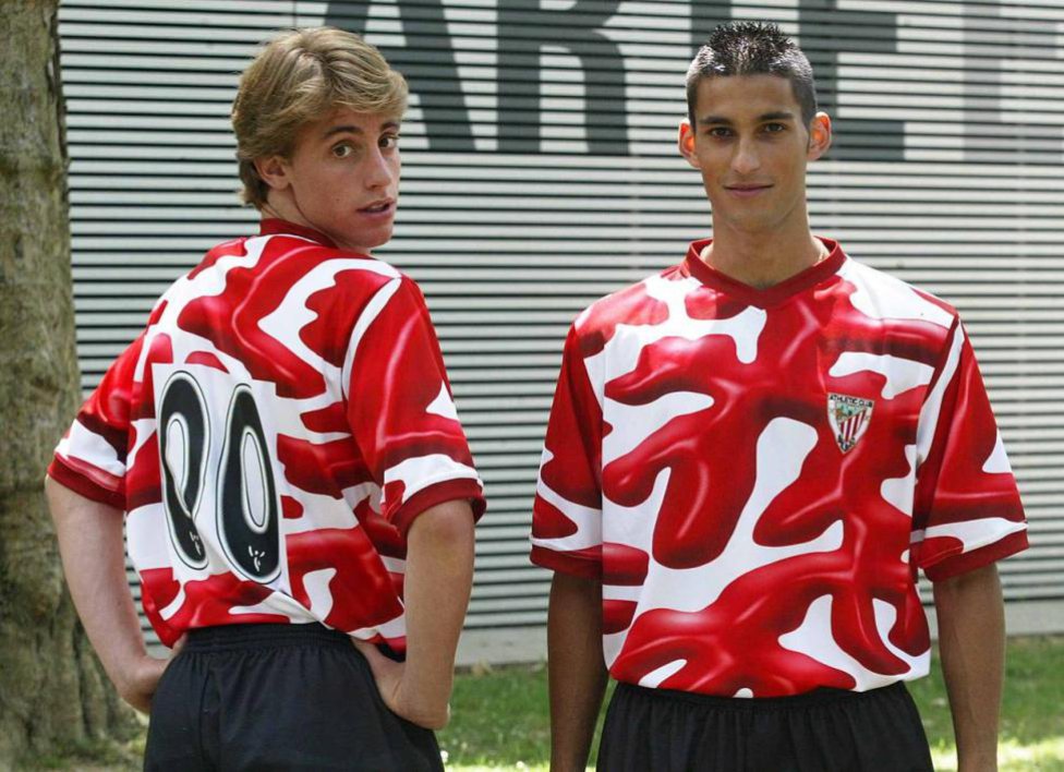
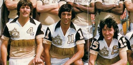
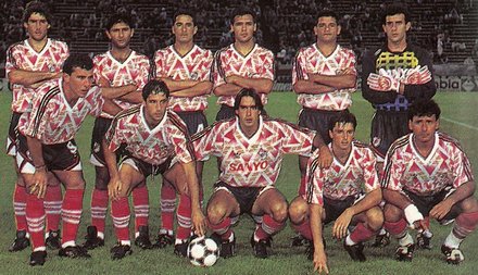
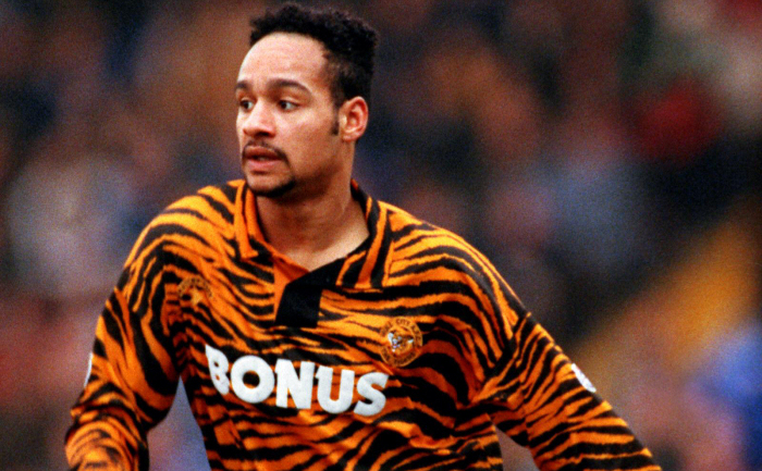
FIORENTINA (1992) T-shirt Fiorentina He caused a stir. Regardless of whether it is beautiful or ugly, the seriousness of this design is the presence of Nazi swastikas which apparently they were formed by chance. The brand had to apologize and remove the T-shirt market (UK Sports)ATHLETIC CLUB (2004) A club with tradition and the history of Athletic Club de Bilbao You can not afford such outrages to something as sacred as the shirt. Definitely, a stain (ketchup) in its history (As) COLORADO CARIBOUS (1978) Fringed shirt Colorado Caribous of 1978, Divine Death. La franquicia norteamericana quiso dar un impulso al ‘soccer’ y la jugada no salió demasiado bien aunque lo que está claro es que impacto tuvo . Definitely, one of the ugliest history t (Colorado Caribous).RIVER PLATE (1990) Another club with a history and great fans who can not afford certain designs is River Plate. El club ‘millonario’ He had a rather embarrassing alternative to mid-shirts 90 which was showered with criticism and rejection by fans (Goal.com) HULL CITY (1992) A new proof that 90 They were difficult years in which to spawn in the form of T refers is that of Hull City. The designer took the letter to the nickname of the club's fans, known as tigers, and he wanted to translate it into T-Shirt Hull City. So ugly it has become a collector's item (bvclamson)