The strange shields of the Italian League in the years 80
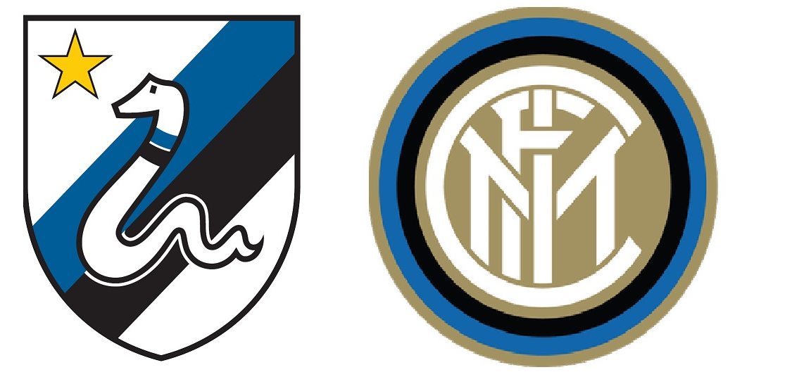
The shield and the shirt are the most sacred hallmarks of a football club. In the years 80, the Italian Liga it had the best footballers and the clubs innovated in the designs of their logos. Fortunately, most of them were short lived, yes, remain in the memory of those who are already an age.
ROMA
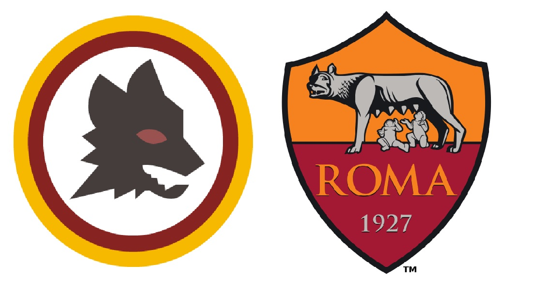
The Roma is one of the greats of the Italian League. Although he has not achieved a large number of titles, has a great hobby and a magnificent stadium. His eighties coat of arms is one of the few that is saved and those of us who knew football at that time remember it with a certain longing.
LAZIO
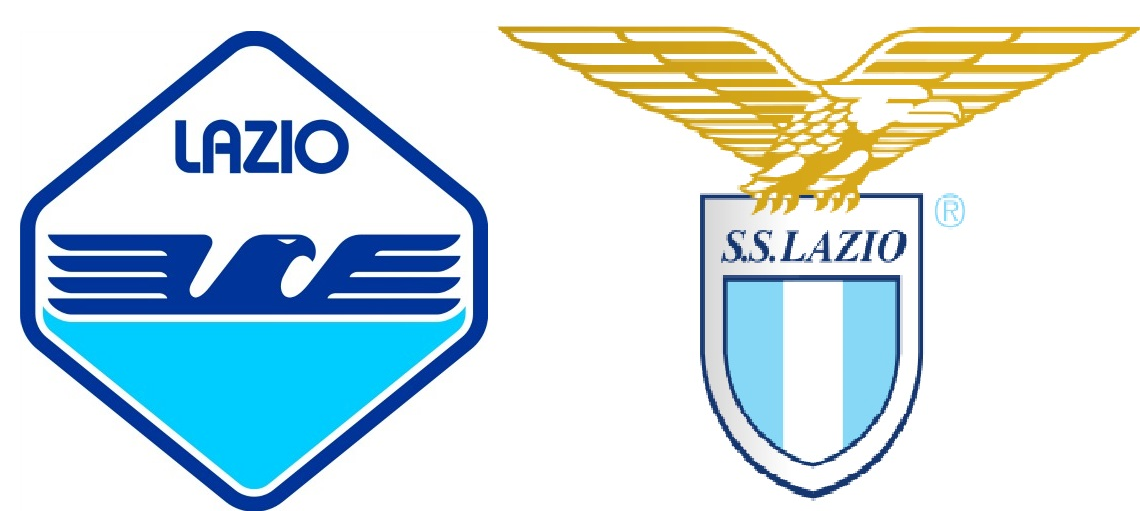
The eagle has been one of the great symbols of the Lazio and has been almost always present in its different shields. The design of the 80 (The one on the left) It has also been used today both as a shield and in the design of the shirt. Another one that is not bad at all.
INTER MILAN

If there is a prize to be given to the ugliest shield in the Italian Liga in the early 80, the one with the snake Inter would be one of the great candidates. We saw it in the chest of great footballers of the time as the trio of Germans formed by Brehme, Klinsmann Y Matthew. Fortunately, it didn't last long.
AC MILAN
If the Inter with the snake it was ‘strange’ the AC Milan of the devil’ wasn't much more successful either. Another that we could barely see and that many will not even remember. Fortunately, they realized that it was not a very successful design.
JUVENTUS
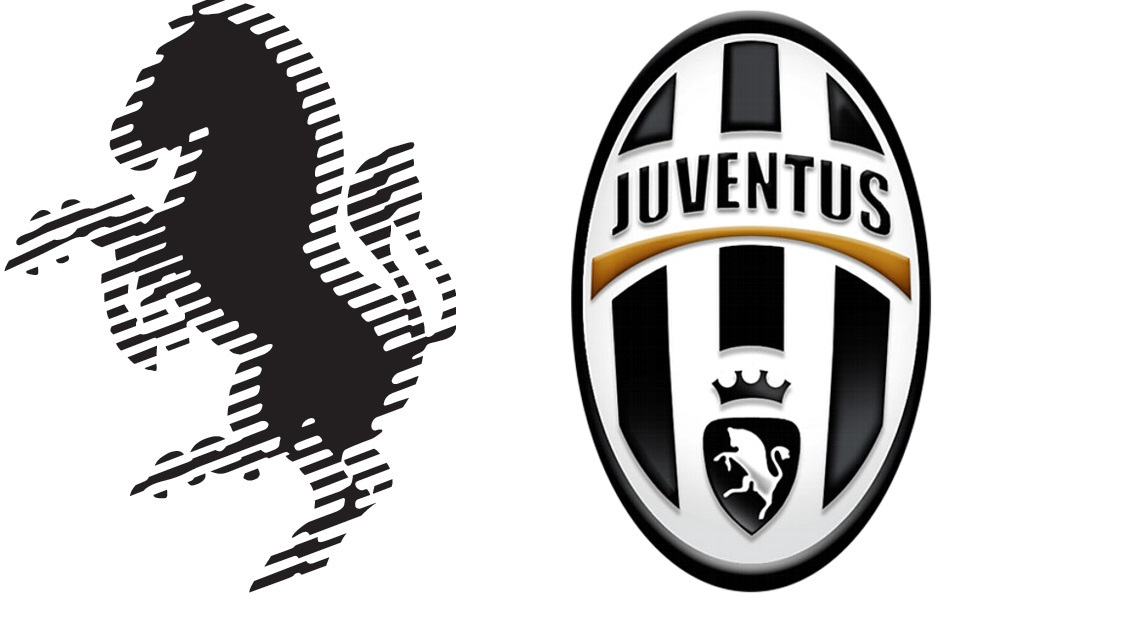
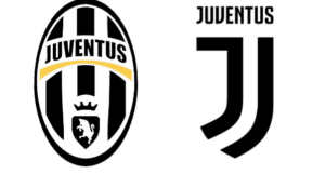
The Juventus is one of the clubs in the Italian Liga that innovates the most in its logo. In fact, currently she wears a huge ‘J’ who has received all kinds of criticism. His eighties shield is difficult to see, especially if you suffer from epilepsy or have vision problems.
TURIN FOOTBALL
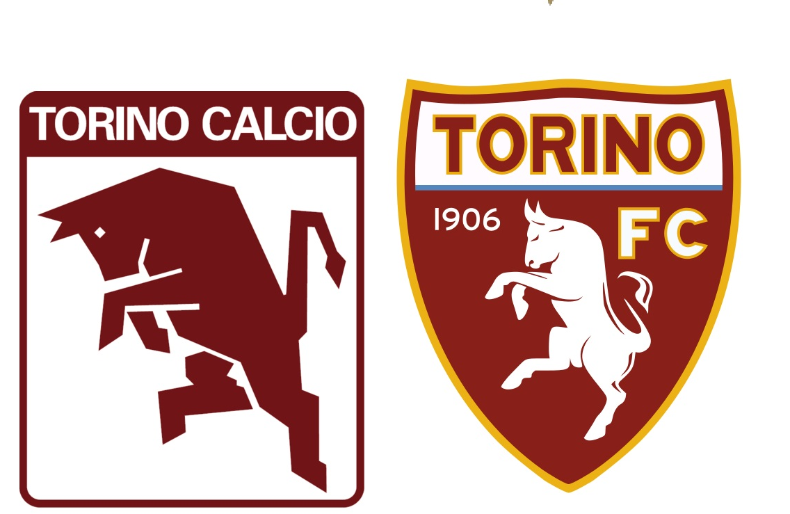
The design of the Torino is one of the few that, possibly, was better than the current one. At least they didn't go crazy in a time when Italian clubs were over-innovative and kept a line befitting their lifelong crest.
FIORENTINA
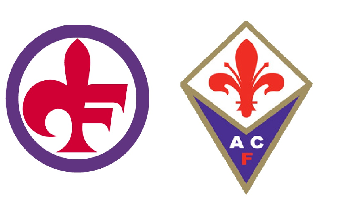
The Fiorentina went further and put his huge logo in the chest of his footballers for quite some time. It is not the worst though, possibly, classic design is much more beautiful.



What a pleasure you have. The one of the Inter of the 80 it is the most beautiful by far. What is a poop is the jumble of letters from after.